Are you puzzled, staring at your high-performing team and impressive portfolio, wondering why your sales pipeline feels more like a dribble than a deluge? You’re not alone. It's easy to blame the market or external factors, but sometimes the culprit is closer to home—right there in your website's content.
Many creative agency owners overlook their websites, treating them like digital brochures rather than the lead-generating dynamos they could be. But if your pipeline has been eerily quiet lately, perhaps it’s your website that’s silently sabotaging your success.
The top 4 critical elements of a winning website
A well-performing website is a perfect balancing act of several different factors. The following four elements we're about to discuss are non-negotiable if you want a website that not only attracts an audience but also converts visits into tangible leads.
By giving these 4 elements a little extra attention, you will ensure that your online presence serves as an effective extension of your sales team, working 24/7 to deliver the high-quality leads you crave.
Your Hero's Banner
First impressions are everything, and your hero's banner is the handshake that welcomes your visitors. Your hero should convey only one core message: "You're in the right place, and I can solve your problem." Clear, compelling, and concise—three Cs that make for a hero's banner that converts.
For example, instead of a flashy banner that says “We Make Designs That Pop!” try a refined banner that says “We Help E-Commerce Brands Elevate Their Customer Experience Through Design."
Services/Process Page
Listing services is fine, but remember that your potential clients are really in the market for the outcome. If you offer social media management, sell them the dream of top-tier engagement, brand recognition, and sales, not just 'posts.' Focus on the end result, the transformation that your services offer. Ditch the jargon and long lists; speak directly to your client's deepest needs.
For example, instead of saying "We offer social media management, SEO, and pay-per-click advertising,” try "we increase your online engagement by 50%, improve your search ranking, and cut your ad spend in half."
Case Studies/Testimonial Page
A portfolio link won't cut it these days; you've got to tell a story. Case studies should outline real-world challenges you've solved for clients and the strategies you've used to solve them. And let's not forget testimonials. An endorsement from a big name or a jaw-dropping metric can seal the deal. Show, don't just tell, your excellence.
For example, instead of saying "Our client had a 20% increase in online sales,” try "We helped John's E-Commerce Store overcome the pandemic slump by shifting their focus to online sales, resulting in a 20% increase in revenue within two months."
About Me Page
People buy from people, not companies. Specifically - they buy from people who can solve their problems. Everything on your 'About Me' page should revolve around the client. Yes, you're great, but why should they care? Translate your skills, experiences, and achievements into benefits for the client.
For example, instead of saying, “We have 20 years of experience in the industry and have won multiple awards,” consider something like "With 20 years in the field, we know the pitfalls to avoid and have the know-how to save you time and money—giving you a market edge."
Additional Best Practices: The Cherry on Top

But why stop there? The difference between a good website and a great one often lies in the nuanced details. Here are some best practices to add that cherry on top:
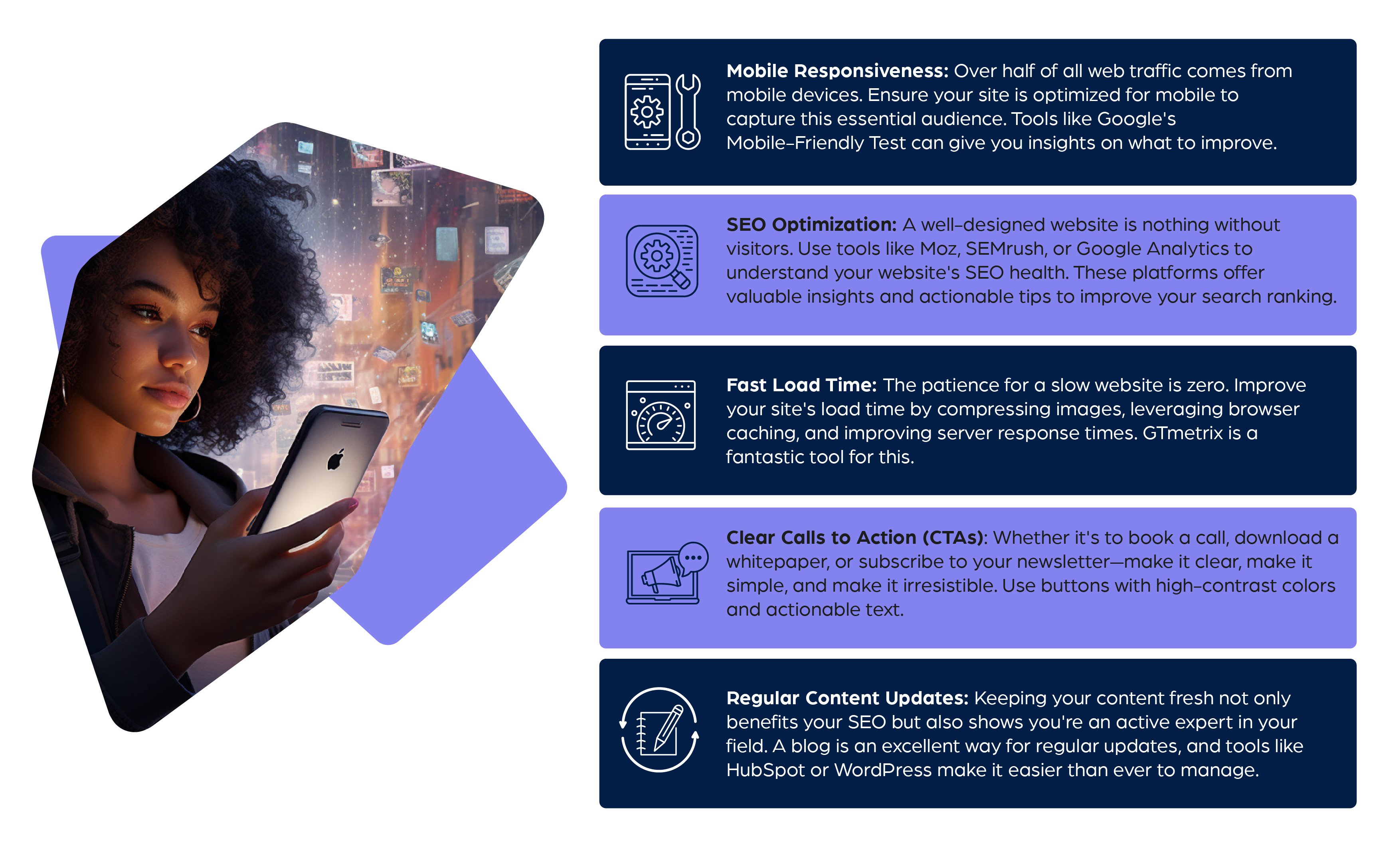
- Mobile Responsiveness: Over half of all web traffic comes from mobile devices. Ensure your site is optimized for mobile to capture this essential audience. Tools like Google's Mobile-Friendly Test can give you insights on what to improve.
- SEO Optimization: A well-designed website is nothing without visitors. Use tools like Moz, SEMrush, or Google Analytics to understand your website's SEO health. These platforms offer valuable insights and actionable tips to improve your search ranking.
- Fast Load Time: The patience for a slow website is zero. Improve your site's load time by compressing images, leveraging browser caching, and improving server response times. GTmetrix is a fantastic tool for this.
- Clear Calls to Action (CTAs): Whether it's to book a call, download a whitepaper, or subscribe to your newsletter—make it clear, make it simple, and make it irresistible. Use buttons with high-contrast colors and actionable text.
- Regular Content Updates: Keeping your content fresh not only benefits your SEO but also shows you're an active expert in your field. A blog is an excellent way for regular updates, and tools like HubSpot or WordPress make it easier than ever to manage.
Finding your true potential
Your website isn't just another box to check off your to-do list. With the right amount of attention and care, what you've dismissed as a digital brochure can become an automated revenue engine. It's not about a facelift; it's about a full-blown transformation—from lacklustre to luminous, from a static page to an interactive experience that engages, educates, and converts.
So go ahead and give your website the TLC it truly deserves. Turn it into your most dedicated salesperson, and watch as your pipeline overflows with the leads you’ve been dreaming of.
